HTML Frames Are Obsolete In HTML5: Here's How To Make Them Responsive
Lots of modern websites have sticky navigation menus that are visible either in the page sidebar or at the top of the page as you scroll up and down the page. However, the CSS features that make sticky navigation possible haven’t always been supported by web browsers. Before this effect could be created with CSS, the HTML frameset and frame elements were used to create page layouts in which certain content remained visible while other content was scrollable.
Contents
The Difference Between Frames and Iframes
When you use frameset you split the visual real estate of a browser window into multiple frames. Each frame has it’s own contents and the content in one don’t spill into the next.
An iframe, on the other hand, embeds a frame directly inline with the other elements of a webpage.
While both frames and iframes perform a similar function – embedding a resource into a webpage – they are fundamentally different.
- Frames are layout-defining elements.
- Iframes are a content-adding elements.
The History and Future of Frames
Frames have been deemed obsolete by the W3C in HTML5. The reasoning given for this is that frames create usability and accessibility issues. Let’s consider each of these charges.
The Problem with Frames
- Usability challenges: With the rise in popularity of mobile devices and tablets with small displays it’s more important than ever that websites offer multiple views which change based on the size of the device viewport. While frames can be manipulated to provide a certain degree of responsiveness, they are simply not well-suited to creating responsive websites.
- Accessibility challenges: Screen readers and other assistive technologies have a very hard time understanding and communicating websites that use frames.
In addition to the accessibility and usability issues created by frames, the trend within web design is to separate the content of a webpage from its presentation.
- Content should be added and defined by markup such as HTML.
- Presentation should be manipulated with languages like CSS and JavaScript.
Using frames is primarily about creating a specific look and layout, a presentation task that should really be handled with CSS.
The Future of Frames
While all modern browser offer support for frames today, the W3C has unequivocally stated that frames “are not to be used by Web developers” and that support for frames in web browsers is offered for historical purposes only.
If you have a website that makes use of frames you should start planning a website migration away from frames. At some point in the future support for frames will be dropped by modern web browsers, and when that happens websites build with frames will become unusable.
How to Create Frames
While frames should not be used for new websites, learning how to use frames can be beneficial for webmasters who are managing older websites.
The Basic Idea Behind Frames
The basic concept behind frames is pretty simple:
- Use the
framesetelement in place of thebodyelement in an HTML document. - Use the
frameelement to create frames for the content of the web page. - Use the
srcattribute to identify the resource that should be loaded inside eachframe. - Create a different file with the contents for each
frame.
Let’s look at a few examples of how this works. First we need a few HTML documents to work with. Let’s create four different HTML documents. Here’s what the first will contain:
<!DOCTYPE html>
<html>
    <body>
        <h1>Frame 1</h1>
        <p>Contents of Frame 1</p>
    </body>
</html>
The first document we’ll save as frame_1.html. The other three documents will have similar contents and follow the same naming sequence.
Creating Vertical Columns
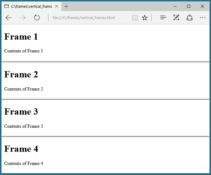
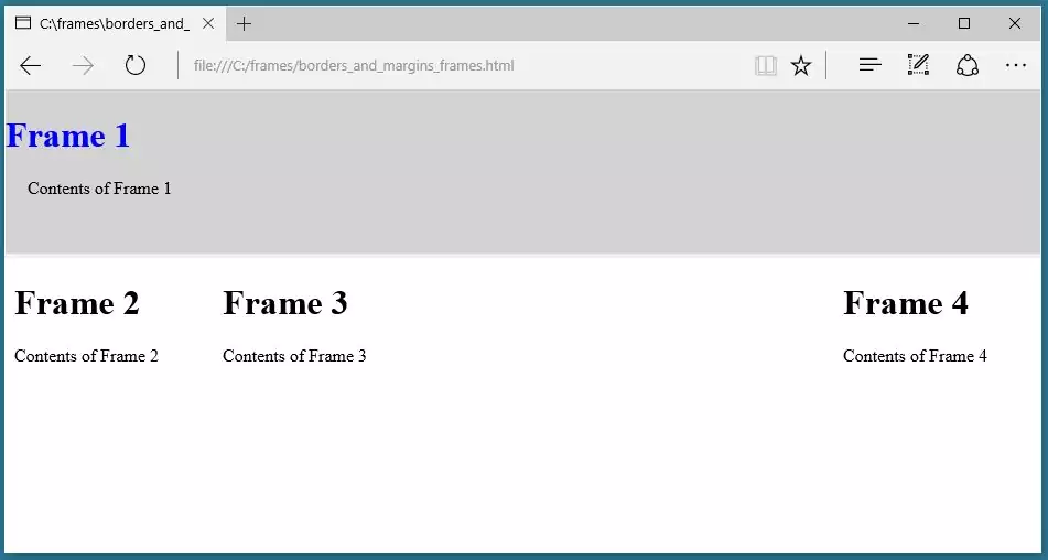
To create a set of four vertical columns, we need to use the frameset element with the cols attribute.
The cols attribute is used to define the number and size of columns the frameset will contain. In our case, we have four files to display, so we need four frames. To create four frames we need to assign four comma-separated values to the cols attribute.
To make things simple we’re going to assign the value * to each of the frames, this will cause them to be automatically sized to fill the available space.
Here’s what our HTML markup looks like.
<!DOCTYPE html>
<html>
<frameset cols="*,*,*,*">
    <frame src="../file_path/frame_1.html">
    <frame src="frame_2.html">
    <frame src="frame_3.html">
    <frame src="frame_4.html">
</frameset>
</html>
And here’s how that HTML will render.
Creating Horizontal Rows
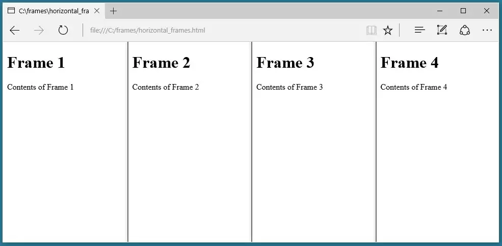
Rows of frames can be created by using the rows attribute rather than the cols attribute as shown in the HTML below.
<!DOCTYPE html>
<html>
<frameset rows="*,*,*,*">
    <frame src="frame_1.html">
    <frame src="frame_2.html">
    <frame src="frame_3.html">
    <frame src="frame_4.html">
</frameset>
</html>
By making that one change, the frames now load as four rows stacked up on top of eachother.
Mixing Columns and Rows
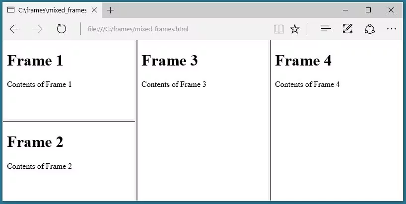
Columns and rows of frames can both appear on the same webpage by nesting one frameset inside of another. To do this, we first create a frameset and then nest a child frameset within the parent element. Here’s an example of how we could nest two rows within a set of three columns.
<frameset cols="*,*,*">
    <frameset rows="*,*">
        <frame src="frame_1.html">
        <frame src="frame_2.html">
    </frameset>
    <frame src="frame_3.html">
    <frame src="frame_4.html">
</frameset>
Here’s the result of that code:
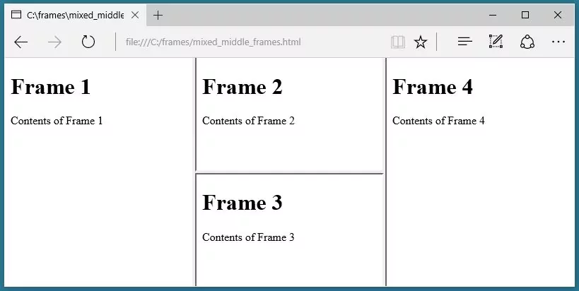
The nested frameset takes the place of the first frame within the parent element. The nested element can be placed in any position. For example, if we wanted the nested element to appear in the center position we would just rearrange the elements like this.
<frameset cols="*,*,*">
    <frame src="frame_1.html">
    <frameset rows="*,*">
        <frame src="frame_2.html">
        <frame src="frame_3.html">
    </frameset>
    <frame src="frame_4.html">
</frameset>
Here’s how the rearranged frames would render.
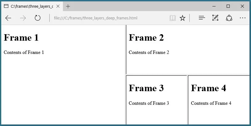
Of course, we can also create additional nested frames if we want to.
<frameset cols="*,*">
    <frame src="frame_1.html">
    <frameset rows="*,*">
        <frame src="frame_2.html">
        <frameset cols="*,*">
            <frame src="frame_3.html">
            <frame src="frame_4.html">
        </frameset>
    </frameset>
</frameset>
That code creates a set of two equally sized columns. We then split the second column into two rows. Finally, we split the second row into two columns. Here’s what that actually looks like.
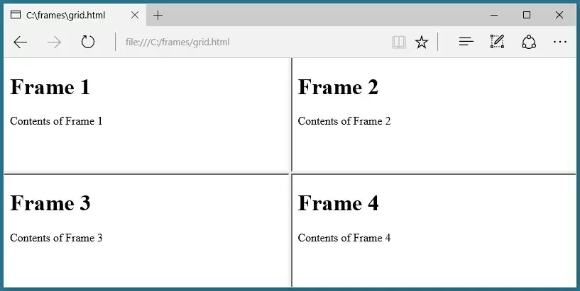
One more way to create a combination of rows and columns is to define a grid of columns and rows in a single frameset. For example, if you wanted a grid of four equally sized frames, you could use the following code.
<frameset rows="*,*" cols="*,*">
    <frame src="frame_1.html">
    <frame src="frame_2.html">
    <frame src="frame_3.html">
    <frame src="frame_4.html">
</frameset>
The resulting grid of columns and rows looks like this.
How to Style Frames
When styling the presentation of a webpage that uses frames, there are two different types of styling to consider:
- Styling within each
frame. - Styling the
frameset
The presentation of each frame must be defined within the source document. The presentation of the frameset must be defined within the parent document containing the frameset.
In other words, frame_1.html must be styled by CSS rules contained within frame_1.html or within a stylesheet linked to frame_1.html.
Styling Frame Source Documents
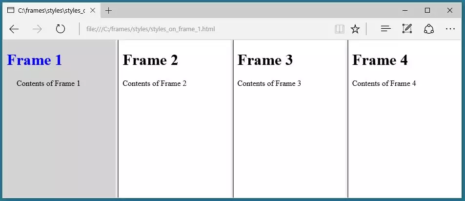
Just as with any webpage, the contents of each frame can be styled with CSS. In order to style the contents of each frame, the styles must be added to the source document itself either by linking to an external stylesheet within the source document or by adding internal or inline styles to the source document.
Considering our four source documents, CSS styles have to be applied to each document individually. Applying CSS styles to the webpage that contains the frameset will not cause those styles to apply to each individual document.
If we want to style frame_1.html we need to add styles directly to the document itself either by linking to an external style sheet or by typing them directly into the document. Here’s an example of how we might do that:
<!DOCTYPE html>
<html>
    <head>
        <style>
            body {background: gray;}
            h1 {color: blue;}
            p {margin: 20px;}
        </style>
    </head>
    <body>
        <h1>Frame 1</h1>
        <p>Contents of Frame 1</p>
    </body>
</html>
If we go back to our original example with four equally-sized columns and load the frameset after making these changes to frame_1.html, we get this:
Styling & Formatting the Frameset
There are a few things you can do to affect the presentation of a frameset beyond styling the documents themselves.
- The size of each frame can be specified and locked.
- The margin between frames can be changed.
- The border around frames can be formatted.
These changes aren’t made with CSS. Instead, they are made by adding attributes and values to the frame elements.
Sizing Frames
Frames can be sized either in pixels or percentages, or they can be set to automatically adjust in size based on the available space. To specify the size of a frame, insert the desired value in the cols or rows attribute.
By default, unless the attribute noresize is added to a frame, website visitors can use their mouse to drag the border between two frames to resize the frames. If this is undesirable, the attribute noresize can be applied to a frame element to prevent resizing.
Let’s put both of these ideas into practice.
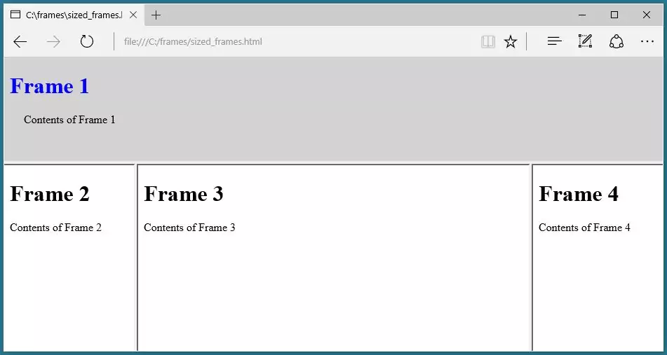
Let’s create the following layout:
- One full-width row along the top of the webpage.
- Three columns below the top row.
- The first and third columns sizes to create left and right sidebars.
- The middle column sized to create a larger content area.
We can create this layout with the following code.
<frameset rows="150px,*">
    <frame noresize src="frame_1.html">
    <frameset cols="20%,*,20%">
        <frame src="frame_2.html">
        <frame src="frame_3.html">
        <frame src="frame_4.html">
    </frameset>
</frameset>
What that code creates is a frameset of two rows.
- The first row is 150px tall. The
noresizeattribute appearing on the firstframemeans that it cannot be resized. - The styles we applied earlier to frame_1.html are preserved, but only affect the contents of that frame.
- The second row expands to fill the remaining space.
- A second
framesetis nested in the second row and includes three columns.- The first and third columns will each cover 20% of the available browser window.
- The second column will resize to fill the space remaining between the first and third columns.
- Since the we did not use the
noresizeattribute on the columns, they will initially render based on the sizes included in the code, but a website visitor will be able to manually resize them.
That code would create a webpage that rendered like this.
Formatting Frame Margins & Borders
Now that we have our layout defined, we can increase or decrease the margin between the frames and also remove the border between the frames if we wish to do so. Using the layout we created in the previous step, let’s remove the borders between the three columns, but leave the border between the upper and lower rows. Let’s also add some margin around the contents of the first frame.
<frameset rows="150px,*">
    <frame noresize src="frame_1.html" marginheight="15">
    <frameset cols="20%,*,20%">
        <frame src="frame_2.html" frameborder="0">
        <frame src="frame_3.html" frameborder="0">
        <frame src="frame_4.html" frameborder="0">
    </frameset>
</frameset>
The marginheight attribute applied to the first frame will add 15px of margin above and below the content loaded in the first frame. The frameborder value of 0 removes the borders from around the three bottom frames.
If we pull up this code in a browser, here’s what it looks like.
Targeting Frames with Links
One of the most common uses of frames is to build sticky navigation into a frame that is always visible regardless of the position of the contents of the other frames. When properly implemented, navigation links will cause new resources to load in one frame while the other frames remain static.
Anchors can be formatted to target specific frames by assigning a name attribute to a targeted frame element, and using the target attributed within the a element to load the href in the targeted frame.
If all of that is a little confusing, let’s take it step-by-step.
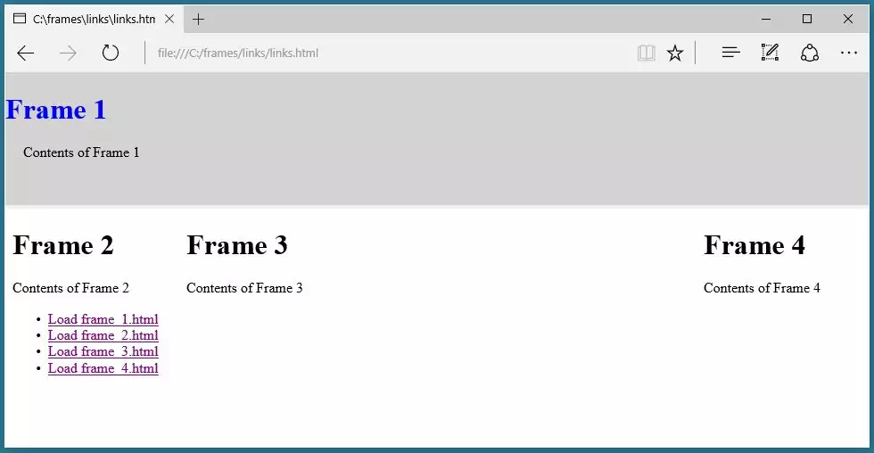
The first step in making this happen is to assign a name to the frame where we want links to open. Using the layout we created just a minute ago, we would probably want to use the left-hand column for our navigation and the center column as our targeted frame. In order to do this, we need to assign a name to our target.
<frameset rows="150px,*">
    <frame noresize src="frame_1.html" marginheight="15">
    <frameset cols="20%,*,20%">
        <frame src="frame_2.html" frameborder="0">
        <frame src="frame_3.html" name="mid_col" frameborder="0">
        <frame src="frame_4.html" frameborder="0">
    </frameset>
</frameset>
Now that we’ve named the center column name="mid_col" we can create a couple of links in our left-hand column source document frame_2.html and target the center column.
<!DOCTYPE html>
<html>
<body>
    <h1>Frame 2</h1>
    <p>Contents of Frame 2</p>
    <ul>
    <li><a href="frame_1.html" target="mid_col">Load frame_1.html</a></li>
    <li><a href="frame_2.html" target="mid_col">Load frame_2.html</a></li>
    <li><a href="frame_3.html" target="mid_col">Load frame_3.html</a></li>
    <li><a href="frame_4.html" target="mid_col">Load frame_4.html</a></li>
    </ul>
</body>
</html>
Now when we load our webpage we have four navigation links in the left sidebar, and when we click a link the contents of that file are loaded in the middle column frame with the attribute name="mid_col".
When we load our page here’s what we initially see.
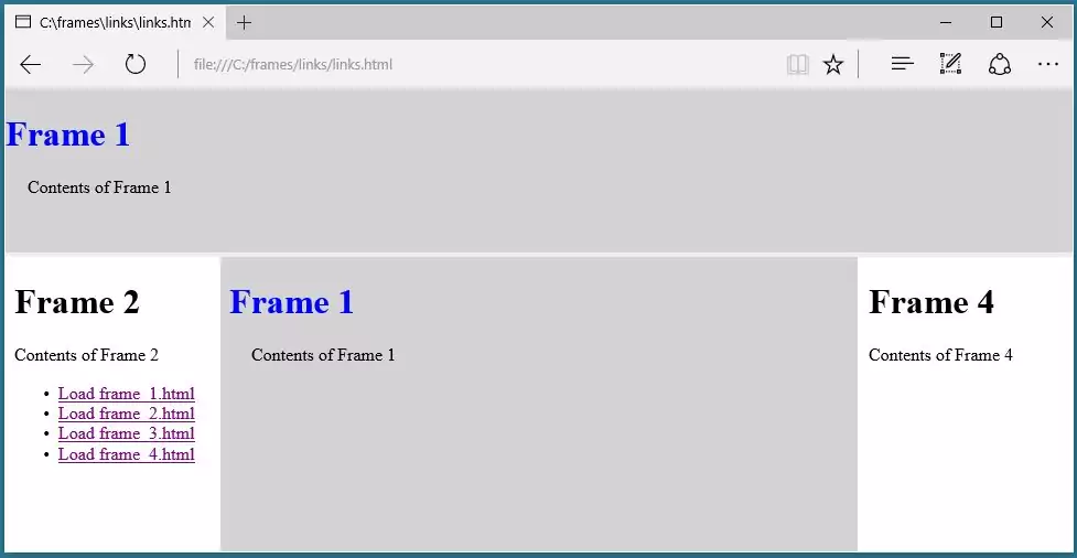
If we click the link Load frame_1.html the contents of that file are loaded in the center column and we get this.
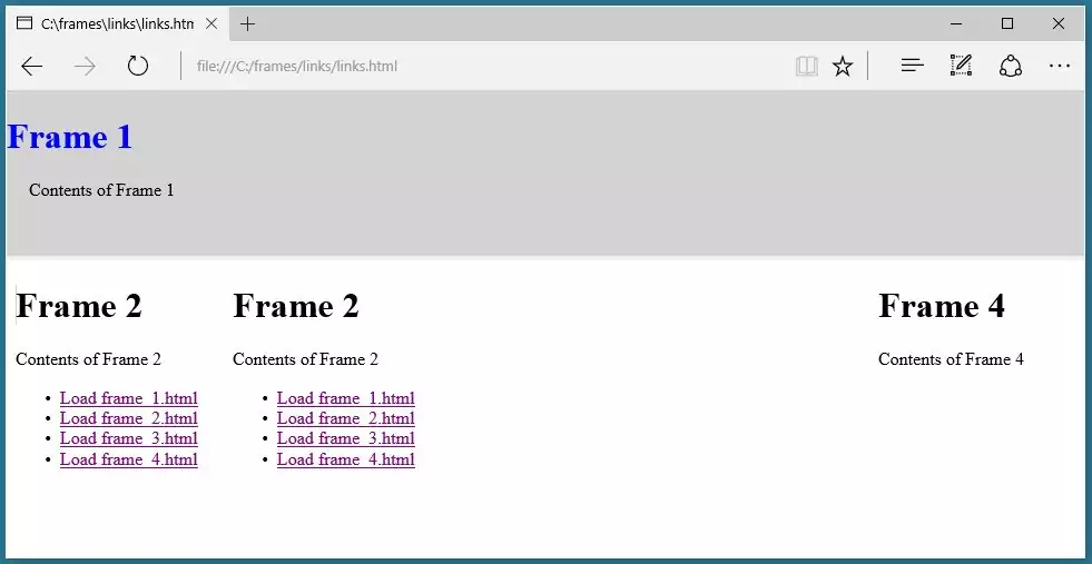
If we click the link Load frame_2.html we see the navigation contents both in the left sidebar and the middle column.
Clicking the links Load frame_3.html and Load frame_4.html would behave exactly as you’d expect, loading the contents of those files in the middle column.
If we forgot to add the target="mid_col" attribute to one of the links, when we clicked the link the resource will load in the same frame that contained the link. If we want to reload the entire page, such as when linking to an external website, we need to add the target="_blank" or target="_top" attribute to the anchor element.
Providing a noframes Fallback
In the past, the noframes element was used to create a fallback for browsers that did not support the use of frames. However, all modern browsers do support frames for the time being, and support for noframes is virtually nonexistent. As a result, it is no longer necessary to have a noframes fallback when working with frames.
How to Make Frames Responsive
One of the problems with frames is that they tend to create usability issues for website visitors using smartphones and small tablets. Since frames have been removed from HTML5 entirely and deemed obsolete, it’s important that the owners of websites built with frames begin planning a redesign that does not include frames. However, until a full redesign can be completed, there are a few things webmasters can do to improve the usability of framed designs.
Use Rows Rather than Columns
If possible, organize frames into rows rather than columns. It is much easier to navigate through content vertically than horizontally on a small screen and frames that are arranged into rows are much easier to view on a small screen than those arranged into columns.
If we compress our column and row layouts onto a simulation of an Apple iPhone 6 screen we can see how rows are easier to view than columns.
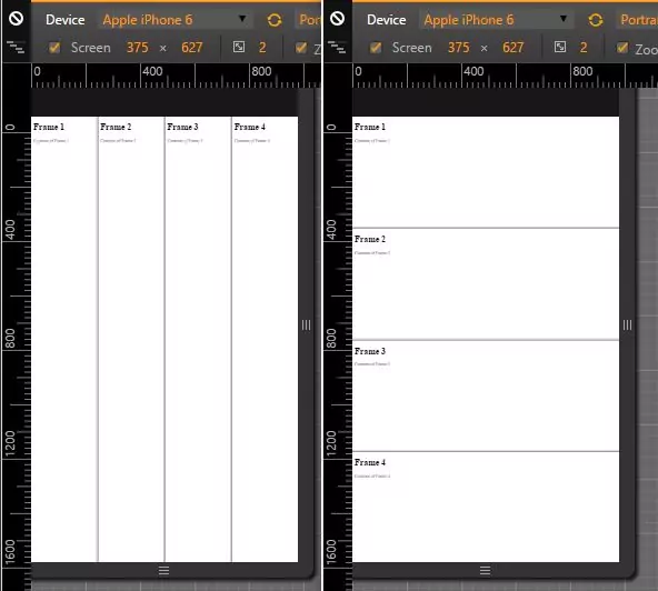
If you had to look at these two sites and try to read them which would you rather look at?
Use Percentages For Column Widths
When columns are sized using percentages rather than pixels they will automatically resize based on the size of the device being used to view the site. While this may create some issues if certain frames become too small, a visitor’s experience will be better overall when column widths are assigned based on percentages rather than pixels.
How to Migrate Away from Frames
Both the frameset and frame elements have been removed from the latest HTML specification, HTML5. Owners of websites built with frames should complete a redesign of their website to remove frames from the design of the site.
At some point, web browsers will drop support for frames. When that happens, websites that still rely on frames will become unusable. As a result, transitioning away from frames isn’t just a good idea, it’s mandatory.
Evaluate Framed Content
The first step to redesigning a website that uses frames is to think through the reasons why frames were used in the first place.
- Were frames used to create a specific layout? If so, CSS can be used to create a similar layout.
- Are frames used to create a specifically sized ad container? There are many ways to duplicate that effect using CSS or a widget designed to work with a content management system.
- Was a frame used to create a sticky navigation menu? Once again, CSS can duplicate this same effect.
- Were frames used to load a resource from an external website? If so, the
iframeelement, which is part of HTML5, can be used to embed content from an external website.
In virtually every case CSS can be used to duplicate the layout created with frames, and iframes can be used to embed external resources.
Have a Strategy for Your New Website
If your website is built with frames there’s a very good chance that it’s pretty badly out of date. Rather than simply dropping all of your website content into a single HTML file and styling it with some CSS, now is the time to think about modernizing by switching to a content management system.
Switching to a content management system will take more work in the short-term, but the long-term benefits of running a modern website far outweigh the short-term challenges.
To help you get started looking at content management systems, here are the three most popular content management systems:
Additional Resources
If you’d like to learn more about frames, the best source for additional information is the World Wide Web Consortium (W3C). Here are a few of their pages with information about frames: