Eye-Tracking Studies: 23 Actionable Lessons
 Eye-tracking studies are a popular way to test the effectiveness of a website, but it can be hard to figure out how to translate the results of these studies into real design implementations. How can you design a page that your readers find engaging?
These are a few tips from eye-tracking studies that you can use to improve the design of making your own blog or website.
1. People like text more than images
Contrary to what you might think, the first thing users look at on a web page isn’t the images. Most casual visitors will be coming to your site looking for information, so they’ll scan the words before they look at photos.
Make sure your website is designed so that the most important parts of your text are most prominent.
2. Initial eye movement focuses on the upper left corner of the page
Most computer applications are designed with the top left hand side as the main focus. That’s usually where you’ll find the logo for the site you’ve currently reading.
You can do your website a favor by keeping this format in mind when creating a wireframe layout. While you want to have a design that’s all your own, you have to keep the habits of your readers in mind if you want your site to be user-friendly.
 3. Users look at the top left and upper portion of the page, before moving down and to the right
Users were found to generally scan webpages in the shape of an ‘F’.
Make sure the important elements of your content are located in the left hand side, across the top and across the middle section keep your readers engaged. Key items, like headlines, subheadlines, bullet points, and highlighted text, should be placed along these lines.
4. Readers ignore banners
Ads may be the bread and butter of your site, but studies have shown that readers largely ignore banner ads, often focusing for only a fraction of a second.
If you’re trying to make money from ads, you need to be creative in your ad placement or in the types of ads you have on your site.
5. Fancy formatting and fonts are ignored
Websites are becoming more saturated with adverts, and reader behavior is changing as a result. Anything that looks too fancy could be glossed over, since readers assume these areas ads and don’t have the information they need.
In fact, studies showed that users had difficulty finding information in large colored letters formatted in this way, because visual clues told them to ignore those parts of the page.
Keep your website streamlined and not so shiny that important elements will be glossed over.
 6. Show numbers as numerals
Readers will find it much easier to find factual information on your site if you use numerals instead of writing out numbers.
Remember the points made above; you’re writing for readers that are going to be primarily scanning your site, so make it easier for them to find what they need.
7. Type size influences viewing behavior
Want to change how people look at your page? Change the size of your font.
Smaller fonts increase focused viewing behavior, while larger fonts encourage scanning.
Depending on your needs, you may want more of one than the other.
8. Users only look at a sub headline if it interests them
Don’t put in sub headlines just to stick to a particular format. Make sure that they are relevant and interesting. You can assist your SEO by making sure all headlines include keywords that will help search engines to index your site.
9. People generally scan lower portions of the page
You can use this habit to your advantage if you give readers something to latch onto when they’re scanning your page. Highlight certain sections or create bulleted lists so information is easy to find and read in the footer.
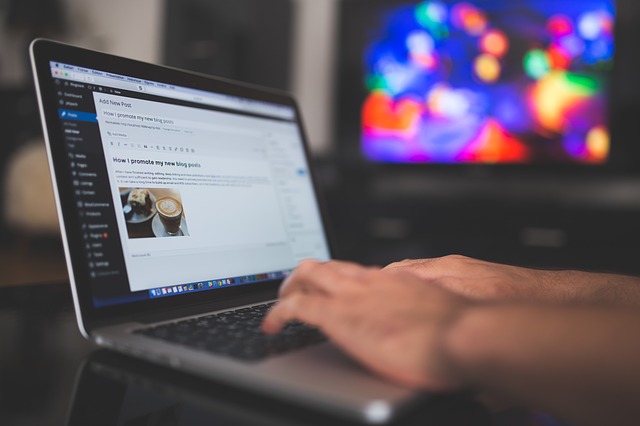
10. Shorter paragraphs perform better than long ones
Information on your page should be designed for the short attention span of most Internet users. Keep paragraphs and sentences short unless context mandates otherwise, such as descriptions of products on an e-commerce sites.
Short content may also render more effectively on smaller screens, such as smartphones.
 11. One-column formats perform better in eye-fixation than multi-column formats
Don’t overwhelm visitors to your site with too much information. Simpler really is better in many cases.
Multiple columns will more than likely by ignored by users, so eliminate clutter from the get-go.
12. Ads in the top and left portions of a page will receive the most eye fixation
If you’re going to place ads on your website, try integrating them into the top left portion of your page, as those will get the most visual attention.
Of course, just because readers see them there doesn’t mean they’ll click on them, so don’t sacrifice design just to gain some extra visibility.
13. Ads placed next to the best content are seen more often
If you want to get your ads seen – and, hopefully, clicked on – incorporate them into your design in a way that places them near the most interesting elements of your content.
Users will still be able to find what they need, but you’ll gain an advantage in advertising if you draw more eyes to the ads.
14. Text ads were viewed mostly intently of all types tested
Like we said earlier, the average internet user generally doesn’t waste much time looking at things that immediately appear to be ads. That’s why text ads perform so much better.
They aren’t distracting, and they blend in with the rest of the content on the page, making them less visually irritating to the reader – and, ultimately, more successful.
 15. Bigger images get more attention
If you are going to use images on your page, bigger is better. People are more interested in an image where they can see details and information clearly.
Just make sure that any image you are using is particularly relevant to your text, otherwise it will most likely be ignored. Most readers have high-speed connections these days, so don’t be afraid to use photos where they’re warranted.
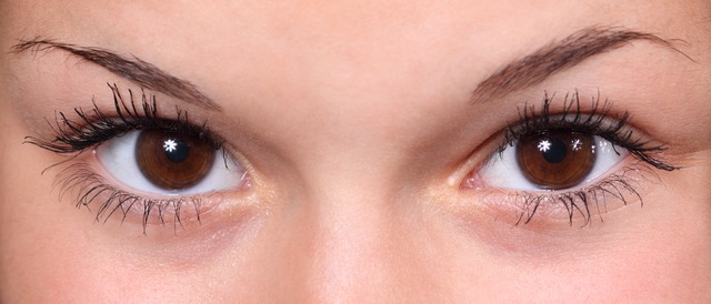
16. Faces in images attract more eye fixation
While they might look good with your design, abstract and artsy photos aren’t going to garner much reader attention. If you’re using photos with people in them, make sure they are clear, easy to read shots.
It should also be noted that photos with real people in will perform better than photos featuring models.
17. Headings draw the eye
One of the first things readers have been found to look at on a webpage are headlines. Make sure yours are unobstructed by other items on the page and that they are engaging enough to draw the reader into looking further through your site.
 18. Users spend a lot of time looking at buttons and menus

Because of this, you’ll want to put in some extra time making sure that yours are well-designed. After all, they not only draw a lot of eye fixation, they are one of the most important elements of your site. Make sure your call to actions are well defined.
19. Lists hold reader attention longer
One way you can break up the paragraphs in your content, and keep users looking through your site, is to make frequent use of a list format for your articles. Use numbers or bullet points to highlight important information within your content. It will make your site more scannable, so it’s easier for users to find the information that they’re looking for.
20. Large blocks of text are avoided
Studies have shown that that your average web visitor isn’t going to take the time to study large blocks of text, no matter how informative or well-written they might be. Because of this, you need to break up these larger blocks of text into smaller paragraphs.
Highlighting specific areas and pulling out bullet points can also help to keep user attention.
21. Formatting can draw the eye
To keep users from skipping over the main and most important points in your content use bold, capitalized, italicized, colored, and underlined text. Use these things judiciously however, as too much will make your page hard to read and send readers away.
22. White space is good
While it might be tempting to put something in every corner of your page, it’s actually better to leave some of your site free of any text.
Sites with too much going on tend to overwhelm users and they ignored a large part of the content. So keep things simple and allow some visual open space for readers to rest their eyes.
 23. Navigation tools work better when placed at the top of the page
Ideally, you don’t want readers to just look at the initial page they came to on your site, you want them to stick around and look at other interesting things as well.
You can help send them in the right direction by making your navigation easy to find and use by placing it at the top of the page.